Exploring es50 for GBIF
It has been suggested that GBIF could make es50 maps similar to what organizations like OBIS are
already doing. I decided to make one for land animals (graph above). link to code
es50 (Hulbert index) is the statistically expected number of unique species in a random sample of 50 occurrence records, and is an indicator of biodiversity richness. The score can be computed without random sampling, but the mean of infinite random sampling will produce the same result.
Obis Definition here
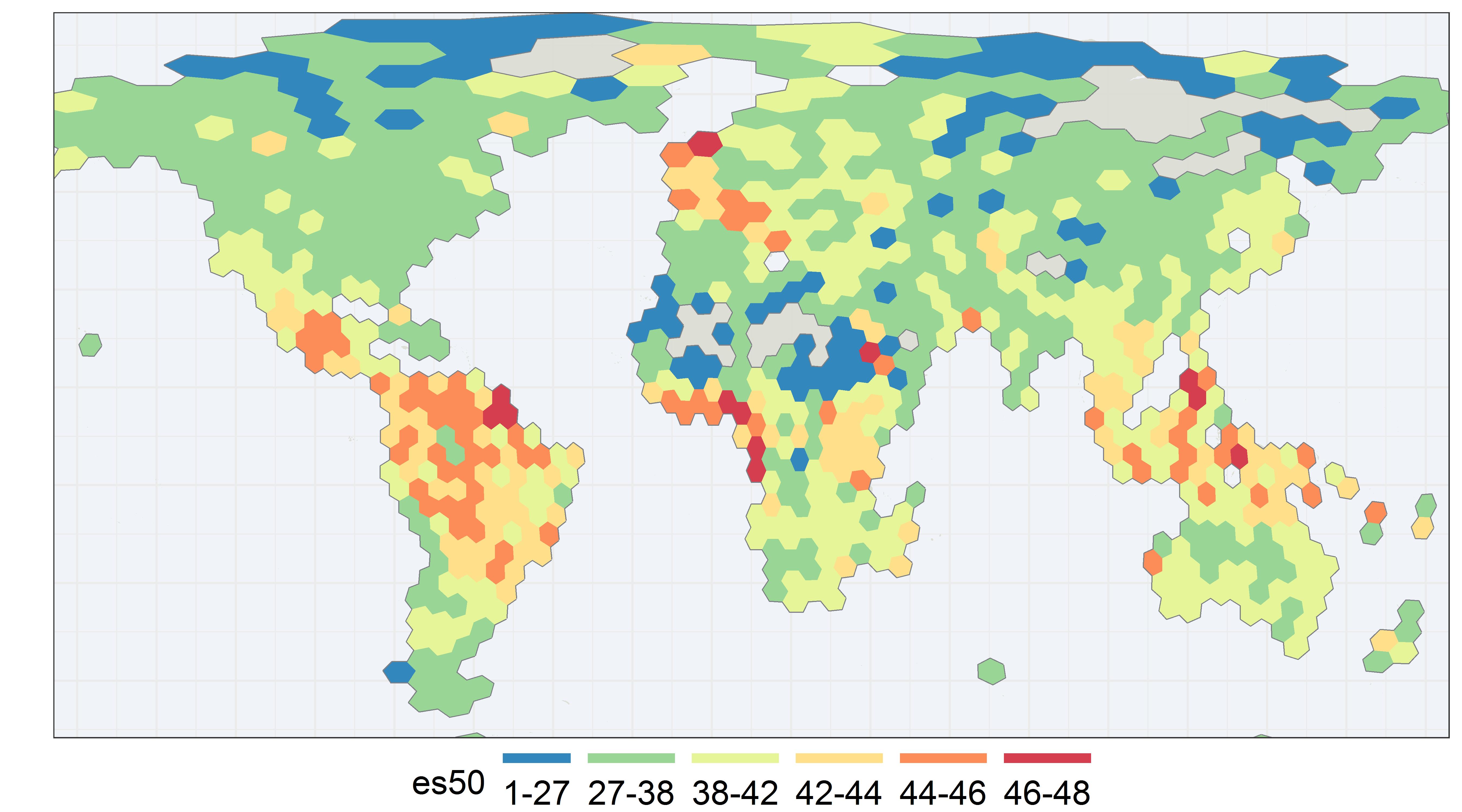
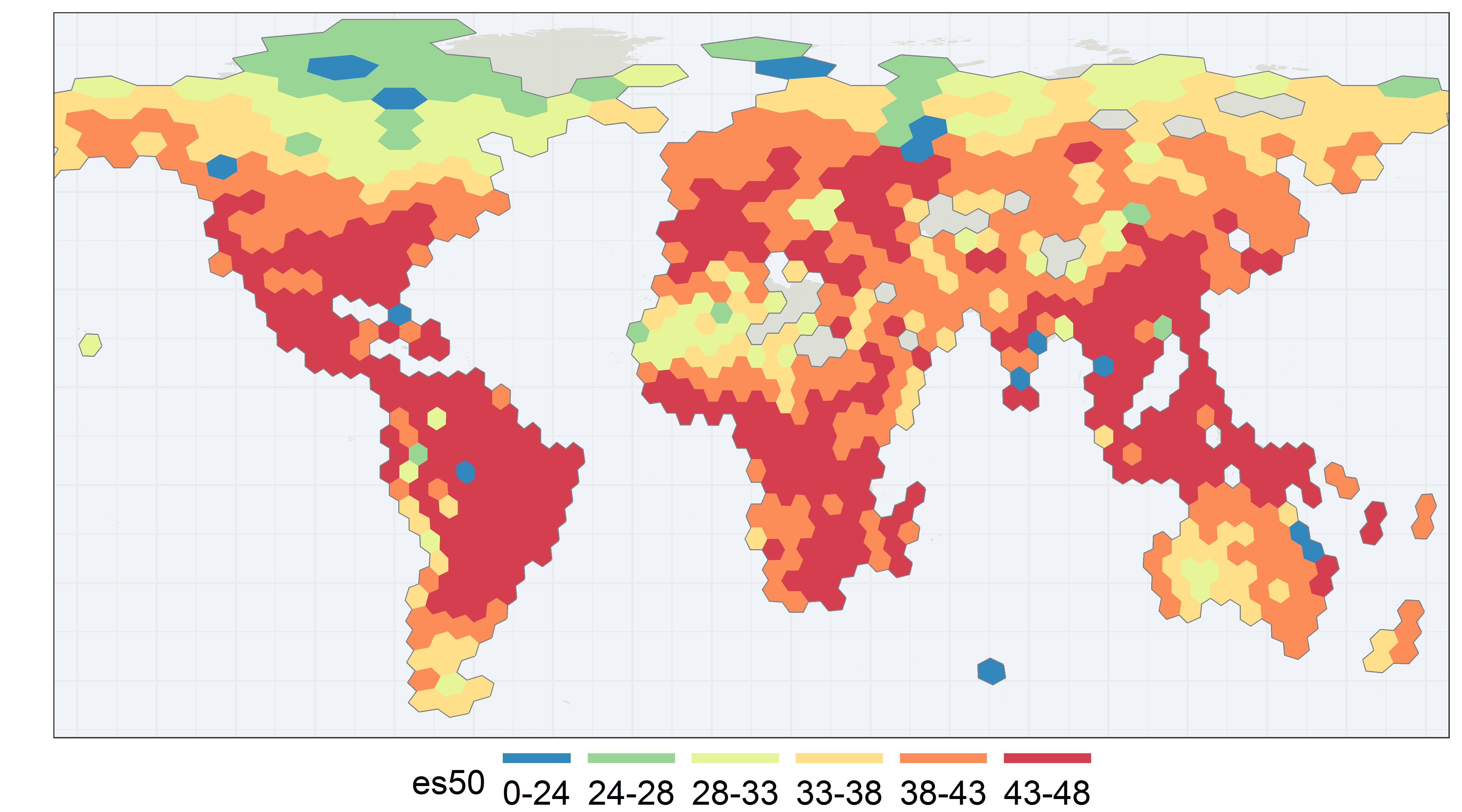
Here I plot a global es50 map for animal genera on GBIF. Each es50 score represent the expected number of unique animal genera from a sample of 50 occurrence records. I chose to use genus here for efficiency and to avoid naming issues, since I did not do any extensive quality control. Each hexagon is about 480 km across and of equal area, as you can see some distortion towards the poles.
link to grid
You might be thinking, why do this strange statistical exercise? Why not just use species counts? Well, one of the main advantages of es50 is that it somewhat corrects for sampling bias.
Species richness is correlated with effort

Here I plot the unique animal genus counts versus the number occurrence records for a global grid equal area hexagons (on land). The amount of occurrence records in a region has is highly predictive of the number of unique animal species that region will have. According to raw GBIF records, Belgium, Sweden, and parts of the USA are more biodiverse than Brazil and Madagascar. And Iceland is nearly as species rich as parts of Brazil. If GBIF were to plot raw species count maps, it would obviously be non-sense because of sampling bias.
Without some correction for sampling bias we might want to turn all of Belgium into a Nature reserve.
Occurrence records are highly biased to the north

Records in North America, Europe, Austrailia, and South Africa make up close to 85% of all occurrence records collected by the GBIF network. And 70% of all occurrence records are found north of 35°. This heavy sampling bias, means most groups will have their center of diversity shifted to the north.
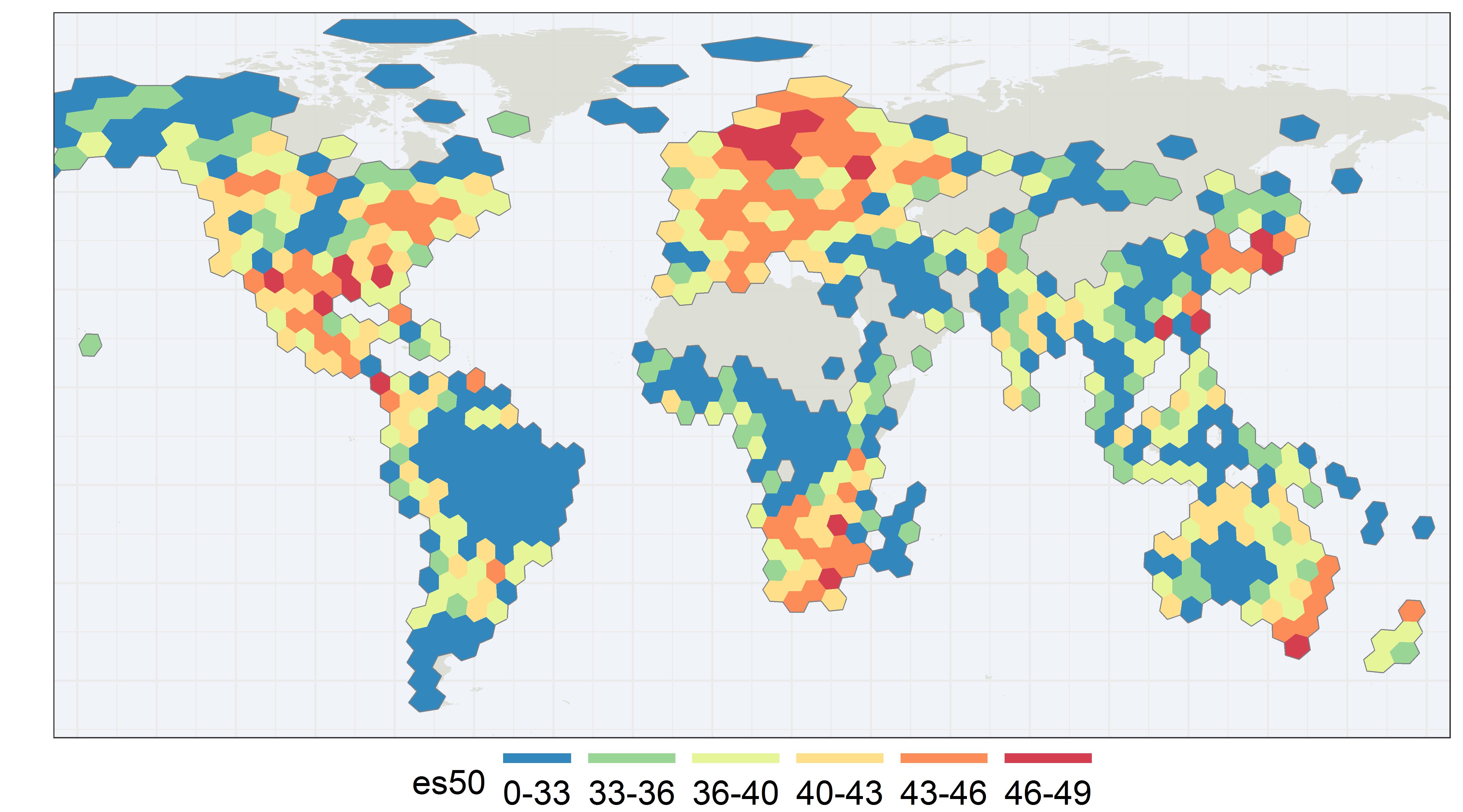
Most raw species-count maps will mirror occurrence-count maps

Here is the raw genus count map for animals. It is not hard to see that it simply mirrors sampling effort. Unfortunatly most groups (with the exception of birds) will probably have maps that look this way.
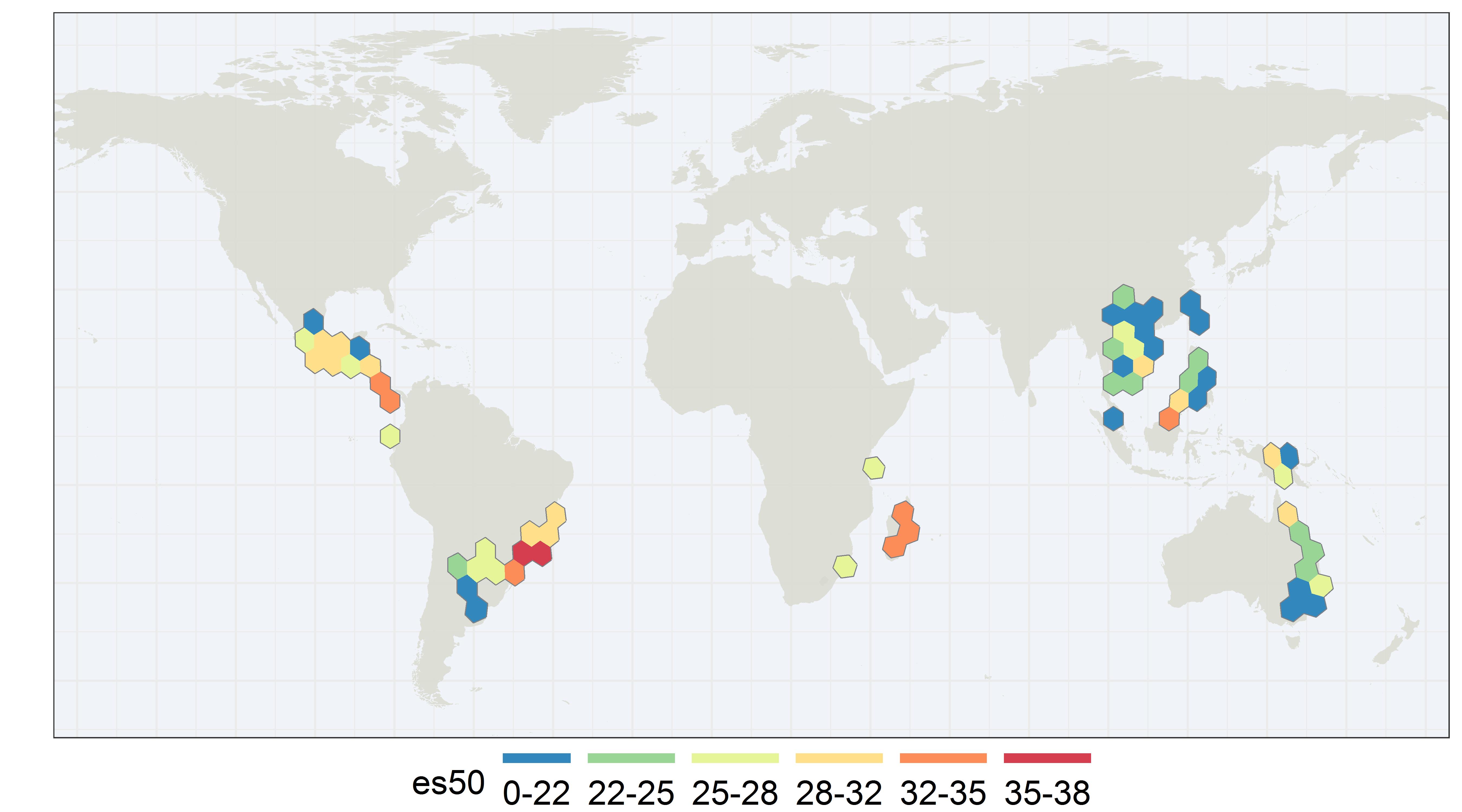
Low species counts in a known hotspot

This a raw animal genus count map of South East Asia shows low-to-medium animal diversity even though this region is a known biodiversity hotspot. The sampling effort in this region is here.
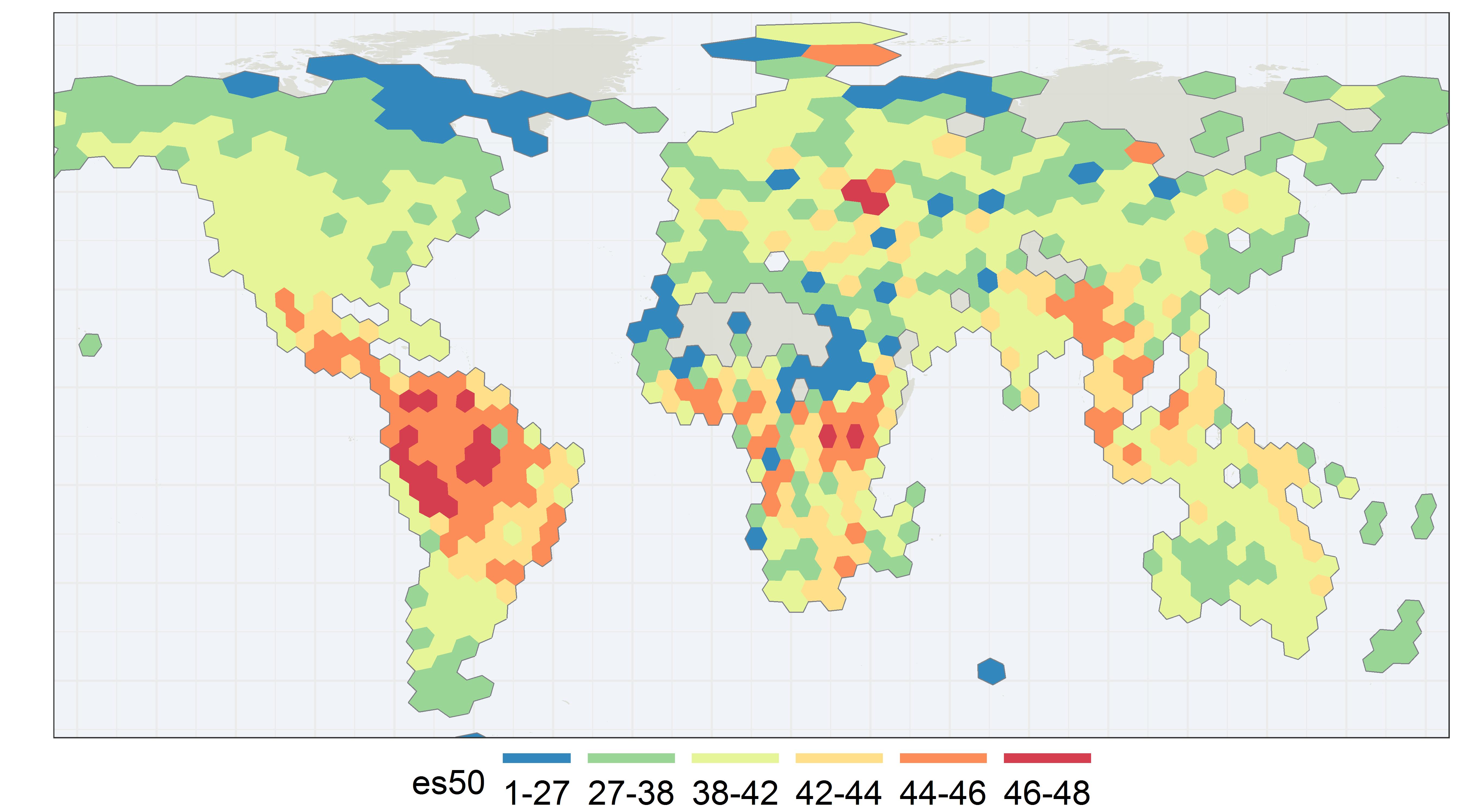
High es50 scores in a known hotspot

Our es50 plot shows most of South East Asia as having medium to high diversity. Although there is still some noise and the result might not be transparent as a simple count map, es50 is able to highlight actual regions of high biodiversity.

Here I plot latitude curves for es50 and genus counts for animal genera. While the es50 curve seems to be still slightly biased near 50°N, the curve obviously is much closer to capturing relative diversity than our genus count curve, which is total bi-modal nonsense and only really shows us effort.
es50 fail cases
es50 does sometimes produce nicer looking maps (see fail cases below), but it does not give us what most people want - species counts. Unfortunately very few taxonomic groups (i.e. probably only birds) are well-sampled enough globally to produce species-count maps that are not mirrored occurrence count graphs. Another drawback of es50 is that your group needs to have a reasonable expectation of having >50 species within a given grid cell (although 50 is a somewhat arbitrary choice).
OBIS Warning: ES50 assumes that individuals are randomly distributed, the sample size is sufficiently large, the samples are taxonomically similar, and that all of the samples have been taken in the same manner.
es50 for frogs - few places with >50 species (sample size violation)

In this map there are many places where there are fewer than 50 frog species even though I use fairly large hexagons. In these cases, GBIF might want to change the threshold from 50 species to something smaller.
es50 for insects - biased sampling (same manner violoation)

In this map, the insect data seems to be too highly biased to produce a reasonable es50 result. Perhaps due to malaise trap proejcts, such as the Swedish Malaise Trap Project. There could also be other high-effort inventory projects in the USA and Europe that violate the same manner assumption.
es50 maps for other groups
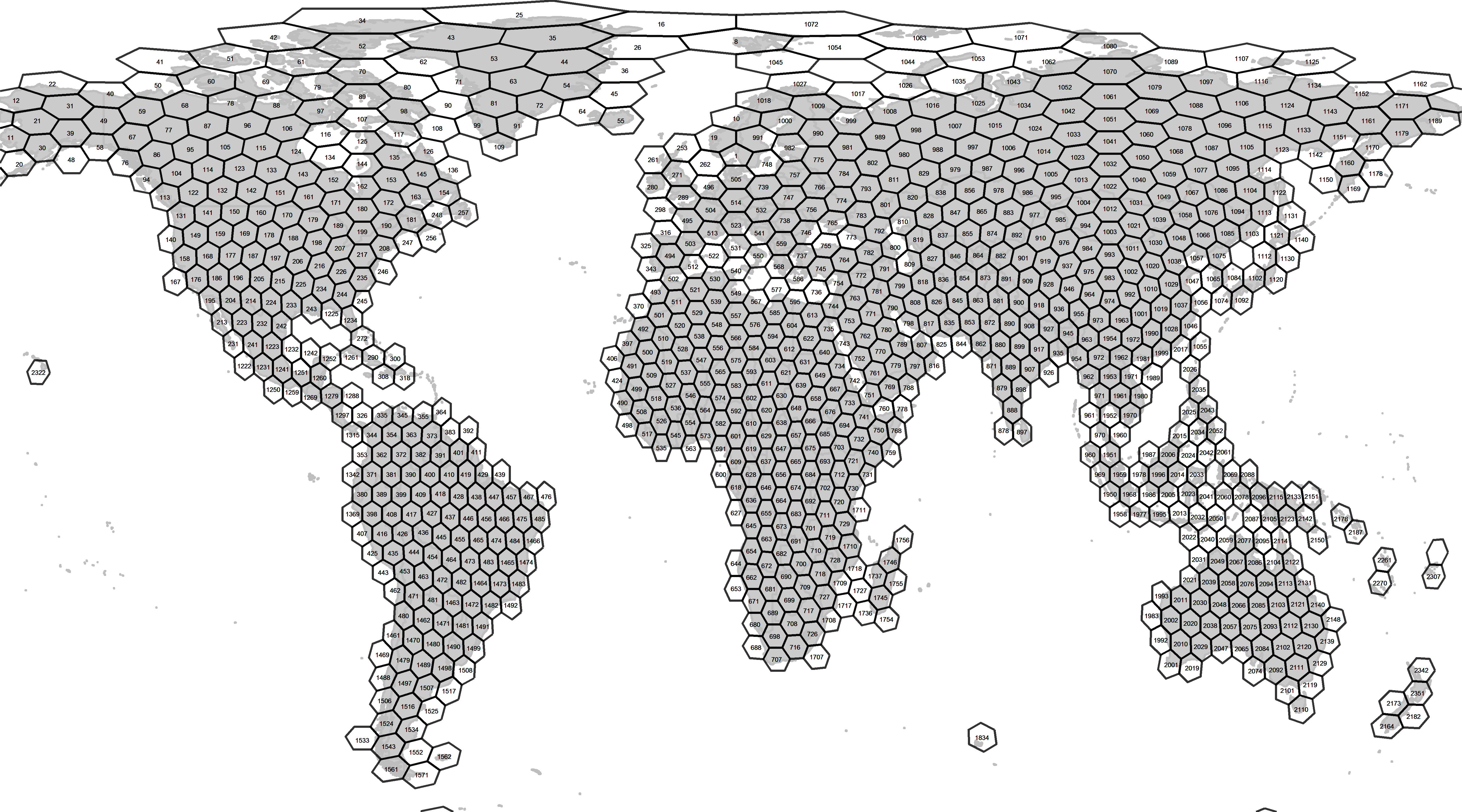
All of the plots below are based equally-spaced (480 km apart) and equal-area hexagons. I generated the grids using dggridR. I also removed fossils and livinig specimens from the occurrence records.